This is my sample layout for my Gypsy class. My goal is to have 2 classes a month, one a layout and the other a card. This month's theme is Fall.
I used this leaf from A Child's Year. I used Hide Contour (see below) to hide all of the veins. Note: if you hide the veins on the first leaf, every leaf you copy will have the veins hidden. Otherwise, you waste a lot of time hiding contour!!!
I wanted the leaves to point down as though they were falling, so I used the Flip button to flip the leaf. Note: you can just cut it out right side up and glue it down upside down.
I wanted 5 leaves, so I used the Copy & Paste button to make 4 copies. I wanted a top layer of leaves the same size, so I copied one more leaf and put it on Layer 2. Back to Layer 1, I lined up 5 leaves down the mat by making the x coordinates all the same value. Then I rotated the leaves alternating -.30 and .30. I overlapped the leaves a bit and welded them together.
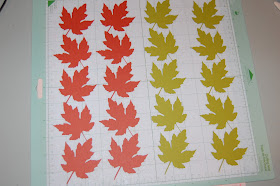
On Layer 2, copy more leaves and arrange them on the mat so you can easily cut out 4 colors of leaves.
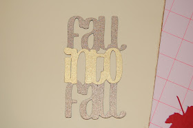
I opened Layer 3 and used Don Juan for the title. This is a great font to use for welding. I wanted my title to be vertical, so I stacked the words on top of one another and overlapped just a bit. I copied the word "into" because I wanted to make a second layer in a different color. Then I welded the title together.
Hide Contour button on the Advanced Menu allows you to hide cuts from your image. I used this to hide the veins on the leaf.
Flip upside down button. I used this to flip my leaves.
Rotate Button is used to turn images. I turned the leaves for my border .30 and -.30, alternating the leaves. Once you press the rotate button, you can use the arrows or the keypad to change the value.
I inked the edges of the background paper, photo mats and the leaves with Vintage Photo Distressing Ink and my fantastyx.
Here are the leaf borders. I used two different colors of leaves for interest.
Here are the leaves to layer on top of the border.
Here is the title assembled.
I typically make a 2-page layout and thought it looked the best with the darker borders on the outside of the two pages.
Once I inked everything, I glued it down. I left some of the border leaves showing (I did not cover all of them up). I folded the leaves in half before I glued them down to give them dimension. I also inked the main vein lines.
Here is the second page. I used the extra leaves to frame the picture. The yellow rectangle is for journaling. I recently cleaned out my ribbon stash and found this gold sheer ribbon and decided it NEEDED to go on this page somewhere!!!
Once again, here is my finished 2-page layout for fall. I can't wait to take some photos to add to this layout....I just love fall colors!


Good job!! I love FAST and EASY LO's. Good job on catching up on your LO's. I'm still YEARS behind on my scrapbooking. :(
ReplyDeletehugs, Tanya
www.scrappinkymomma.blogspot.com
This is such a great layout! Love all the fall colors. Thanks for the great directions.
ReplyDeletevery pretty, Thanks for playing with us at Frosted Designs.
ReplyDeleteGreat job, Lori!!! Love the layout and the colors are autumn beautiful!
ReplyDeleteLori... love all the great fall colors and those beautiful leaves!! You did a fantastic job of demonstrating all the features you can use on your gypsy!! Thanks for taking on our fall challenge at frosted Designs this week!!
ReplyDeletebarb :)