Hi! I am the Guest Designer today at Susan's Blog. This month the theme is My Heart Belongs to _______. Well, I am slowly making progress on my Disney Vacation layouts and figured why not share my love of Mickey with you!!!
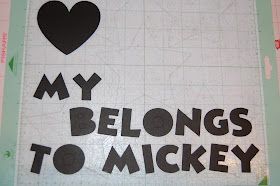
I open my Gypsy Mat to 12x24 to lay out my 2 page design. I start with Mickey Font and sized the letters to 1.46 inches. I put a heart on my mat from Plantin Schoolbook sized to 3 inches. I placed a mickey head from Mickey Font sized at 1.21 inches. I gouped them together (not welded, just grouped) so the Mickey Head would cut out of the heart.
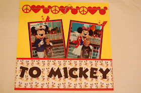
I made a banner with Peace (from Feeling Groovy sized 1.24) Love (heart from Plantin Schoolbook sized to 1.24) and Mickey Head (sized to 1.24). I welded them together and then copied a second banner. The width of the banners is 11.50 each.
I copied the banners and heart onto Layer 2 and cut them out of red card stock.
I copied the heart (minus the Mickey head) and the letters onto Layer 3 and cut them out of black card stock.
I adhered the title to my paper - yellow cardstock with a 3 inch red cardstock & Mickey paper pocket at the bottom of the paper. I pop-dotted the red heart on top of the black heart.
I put the border on the top of the pages. I made some photo mats and a 4x6 journaling tag.
I used some scrap paper, twine and the red Mickey from the heart to dress up the journaling tag.
The photos are tucked into the pocket.
I added a little twine and ribbon and some photos of Tanner before we boarded our Disney cruise.
I like my Disney pages simple because the photos tend to be bright and busy. I really love this layout! Thanks Susan for having me over today!!


Wonderful layout, Lori. I am going to pass the idea of welding the 3 images to make that awesome border and putting the photos into the pocket on to my scrapping daughters :)
ReplyDeleteWhat a great layout! Love it!!!!
ReplyDeleteLOVE IT!!!! I used to have a shirt that said Peace, Love, Mickey Mouse . . . the border on your layout reminded me of that shirt.
ReplyDeleteShawn ~ Getting Cricky Design Team Member
Crafty Chics Blog
and
MyCutSearch.com ~ Find your Cricut images FAST!
Webmasters Earn Money Here!
What a great page spread. Love it. Great to hold so many photos too. TFS
ReplyDeletePeace, Love and Mickey! It just doesn't get any better than that!!!
ReplyDelete