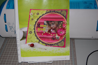
I created this layout after seeing a similar layout in the Summer 2010 issue of Scrapbooking & Beyond. This is me and my brother all dressed up for Easter in 1972 (thank goodness the dates are printed on the photos!!). We are on our "rides" posing for the photo.
This layout was designed by Tracey Taylor and is found on pages 28 & 29. I loved how she layered the circles in the background. I also love that it was not perfectly centered on the page.
I copied the look by layering 3 circles on my Gypsy. The largest scalloped circle is from Easter 2010 and is shown by itself below. I got a lot of questions on this one ~ it is my favorite image from the Easter cart!! The scalloped circle is from Lacy Labels as well as the plain circle.
Here is the pretty scalloped circle from Easter 2010. If you center the scallop on your page, you can use the negative on a different page.
I used A Child's Year for the title. The flowers came from Michaels ~ they are silk flowers that I just took apart. I added some brads for the centers. I put the tulle behind the photo to soften up the page. I added pencil lines for journaling.
This is another layout that I used the same circles, but centered them on the page for a different look.


4 comments:
These are such a beautiful layouts and each so different even with their similarities! TFS
Great pages, Lori! I've really been into using giant circles in my layouts lately, too. Such a great idea!
Both of these LOs are fabulous!! i always find it amazing how you can cut the exact same shape from two different papers and end up with two totally different LOs!! I really like the disney one!! with a trip coming up in October, I may just have to lift this one!!
Barb :)
Love-love your layouts!!!
Post a Comment