Hi! Today is my day over at ShesASassyLady with a layout that pretty much sums up my life right now ~ baseball season! We have baseball 3-5 times a week. This past Saturday, Tyler got to play at Werner Park Stadium which is the home of the Omaha StormChasers - the minor league team formerly called the Omaha Royals.
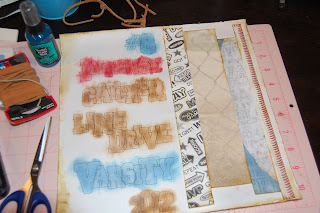
I wanted to try a new technique that I saw in the Spring 2012 issue of Scrapbooking & Beyond - inking words on scrapbook paper. I used Varsity Letter and overlapped the letters and numbers on my Gypsy. I changed the sizes for an interesting look.
I used my Chomas Creations gel pen holder and a black pen to draw my words and numbers on a piece of white cardstock. I used the colorblok paper that has a little texture on it.
I took this photo of Tyler on the day of his first game before his pants got dirty.
I distressed and inked the edges of the paper and inside the images.
I spritzed the paper with turquoise Perfect Pearls Mist. This caused the inks to blend and bleed a bit plus it added a little bit of shimmer. I trimmed some baseball papers to create a backdrop for the photo and spritzed them too.
I added a hemp stitch to each corner. This helps to keep the paper from curling up and adds to the "boyed down" look. You can see the paper here - I think it looks like canvas.
I used some leather cord as a border and glued on some knots.
I added Tyler and his jersey number with these tiny stickers.
I used this large glove sticker (I believe it is Jolee's) that I bought years ago. I wrapped it for my son for Christmas - he got to pick out a new baseball glove. It finally has a permanent home!
In hindsight, I think the words and numbers would look better a little smaller. I also would skip the red and find a darker blue to match the jersey. All in all, it was a fun and messy project!


6 comments:
I love this technique!! Thanks for sharing.
I like the red, but I would have used it on a different word that's all. Very cool page, Lori!
Lori what a beautiful page . Love the detail and the colors and look how handsome your son is. He is getting to look so grown up, I bet he has all the girls chasing after him. Fun page thanks for sharing with us at She's A Sassy Lady.
Love the layout. Cool title coloring. Love it. TFS
Oooohhhhh!!!! That's what those pens are for? I didn't even know this was possible!!! SO STINKIN' COOL!!!!
I just LOVE the writing on the side! Love your layout! I'm just sayin' I got scrap lift this layout! LOL
Post a Comment