Today I am pulling double duty at two of my favorite places - Frosted Designs and Let's Scrap!!
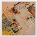
For Let's Scrap - we are celebrating National Scrapbook Day all month. Today is my challenge - 3D! I pop dotted my pictures to my layout and added wood pieces.
For Frosted Designs, I am showing how to FOCUS in order to create a great scrapbook layout.
It is important that we FOCUS on a few things when scrapbooking!
First of all, make sure your photos are in focus and are the best photos of the bunch to tell your story. Just because we take 15 pictures of each event doesn't mean we need to scrapbook (or even print) all of them!! This took me several years to learn this!!
Also, make sure your page has a focus. If you don't have a clear focus - the page is confusing to others and they will quickly look at it and move on. If you don't have a theme - make one!!
The eye naturally travels over a scrapbook page in a Z pattern. Try to place your photos and embellishments in the same pattern.
For this layout, I used a sketch:
I used the left page as my guide. Sometimes a sketch helps me keep my focus!!
My focus for this page is the random single photos that recap some of Tanner's highlights of 2nd Grade - the book fair, the Pancake Man and the marble run the class made.
I had only one photo of each event and did not want three separate layouts. The colors in each photo were close enough that they did not clash when all put together.
I used this yummy paper and tag from the Simply Sweet Kit!
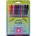
I used my tag for my title and hand wrote the highlights with my white gelly roll pen.
I added some wood veneer school themed pieces on my paged on the corners of two pictures and the bottom left hand corner. I added white numbers at the top bottom opposite corners.
I tucked a burlap weave ribbon behind the photos to ground them. Without it - they would be floating on my page (or out of focus).
I sure hope this helps you with your layouts - I know it has helped me!!


No comments:
Post a Comment