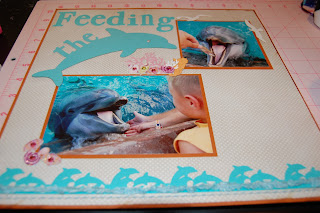
Hello!! I am excited to be on TheBugBytes with a very fun layout.
When we were at Sea World recently, my most favorite part was feeding the dolphins. I started designing this layout on the plane ride home!!!
When I create a 2 page layer, I typically open a 12x24 mat on my Gypsy and lay things out on the first Layer.
I welded the letters "the" on the back of the dolphin,
I had some trouble with my dolphin border (two welded together). The inner cuts were too intricate and they tore.
From the advanced menu, I used Hide Contour to hide the inside cuts.
I planned on layering two borders (one on top of the other) along each page. I had a limited amount of this tourquise paper (thanks to the tearing), so I just used the one.
To add some dimension I used twine and fuzzy ribbon.
Once I cut out the title, I kept the negative piece to use as a template to glue the letters down in a straight line.
I found some sea shells and coral from Paper Doll Dress up. I grabbed some fish, seahorses and birds from Life is a Beach. I hid the extra fish and stretched this one out a bit to make it longer ~ I wanted it to mimic the fish we fed the dolphins.
I took a scrap of white cardstock and my Score Board and created this tiny paper box. I trimmed the corners and glued the sides together.
I took this shape from Lacy Labels size at 7.71 inches to tuck behind my larger photo.
I added some paper coral, shells and seahorses around my photos. I added the white birds to the top of my layout.

I took a scrap of yellow paper and used a border stamp to soften the edge. I hand wrote the journaling and tucked it under the photo.
Thank you Pam for having me over today!!!


2 comments:
Great layout and that must have been so much fun!
Love this page.... It is amazing what we can do with our Gypsy isn't it? you sure made yours dance!
Post a Comment