I am super excited to be featured at Frosted Designs today! I am starting a brand new series - I am going to help guide you on how to
Tell Your Story Through Scrapbooking. I taught
Scrapbook Design and You (SDU) classes at Michaels and got my certification
through EK Success (now called Spotted Canary).
SDU is a four week class, but here at Frosted Designs, I plan to give you condensed “shots in the
arm” versions each month to help you create your story on paper.
Today I am going to focus on BALANCE. Balance happens to be my One Little Word for 2014 so I thought it would be a good place to start.
Balance means different things in scrapbook layouts. It can be difficult to find the balance between pictures and titles (sizing), or the balance between having too many pretties (embellishements) or not enough, or even the balance of how much time you are spending to make it a "perfect" layout compared to how much time you can spend scrapbooking.
Balance can also help you put everything together so it looks pleasing to the eye. Most people spend 5-10 seconds looking at scrapbook layout in an album - you want to find a way to keep their attention and have them notice the most important part - the photos!!
We are going to focus on balancing our pictures and titles within a layout. My go-to title used to be 2"x12" which is a 1/6 of the page!! On some layouts that works just fine. I had to look at what I wanted the title to represent - a headline, or a one-word POP or something in between.
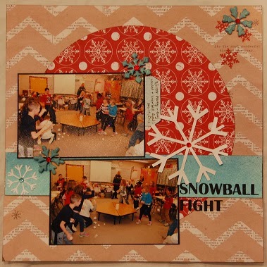
For my layout today, I am scrapping my son's Winter Party at school. He begged for a snowball fight - so I wanted to use that as the title. I had 3 photos, but picked the best two because they were all similar and very busy photos. I wanted to keep the layout pretty simple so it did not compete with the photos.
I found a sketch to use (which is optional but sometimes helps). The title is small on the sketch, but I don't always follow the sketch exactly so I came up with some different versions to see what looked the most balanced.
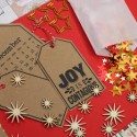
I used my cameo to create these visuals for you and I added my supplies. As much as I like the bigger title, I think the medium title looks best (like in the sketch). While all three sketches are good, the first two options have too much white space and don't hold my interest as long as the third option. As you can see, there are NO WRONG answers in scrapbooking - just guidelines!
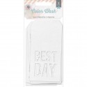
I really wanted to use the tag Best Day because that is how Tanner described the party.
I really wanted to use the tag Best Day because that is how Tanner described the party.
I used some Heidi Swapp ink to mist the tag and snowflakes as well as a piece of watercolor paper. As you can see above, the Best Day is larger than my title and does not look balanced - it looks like I have two competing titles - so I took it off.
Instead I used the top side of the tag and wrote my journaling on it.
Here is my finished layout. I am very happy with how it turned out. By the way, the snowballs are crumpled up pieces of tissue paper.
Thank you so much for joining me today! Balance can be used in many different projects, not just scrapbooking. But if you do create layouts, you should consider the monthly scrapbook kit - I used papers from the Season of Stars Scrapbook Kit and chipboard snowflakes from the December Mixed Media kit. The kits are packed with coordinating papers and embellishments.
I would love to hear from you what topics you think will help you create your pages. Please leave me a comment to let me know what you would like to see next!


2 comments:
I am so excited that you are sharing this series with us Lori! I am looking forward to learning all kinds of tips from you!!
barb :)
So nice of you to share what you have learned! Hoping we get more scrap bookers...tired of cards at this point!
Beautiful and sweet lay out!
Creative Wishes
Claire S.
www.scrapmyway.blogspot.com
Post a Comment