Happy 2011! Today is my day to be Sassy over at She's A Sassy Lady and I created a 2 page layout highlighting my top 10 events from 2010.
I started out by putting a rectangle on my mat from George and unlinking the Aspect Ratio Link (the chain between the Width and Height on the Basic Menu). I changed the Width to 0.62 and the Height to 12.00. I copied it and moved each rectangle to either sides of the mat. I copied another rectangle and rotated it 90 degrees. I copied one more and moved one to the top of the mat and the other to the bottom of the mat.
I made another copy and positioned it at X5.74 Y-3.16 to create a border on the bottom of my layout. I grouped and welded the 5 rectangles. ***At this point I save my project as lo.frame.3(I have two similar versions saved already). The next time I want to make a similar layout, I have the basics ready to go.
I used the "ten" border on Graphically Speaking and stretched it to 11.25w x 2.25h. I moved it into the border space and welded it. ***Copy and paste onto Layer 2 so you have a page 2.
Go back to Layer 1 and add the words "Top 10" from Varsity Letter at 1.29w x 1.77h. Move them up into the rectangle a bit and weld.
On Layer 2, repeat with the words "In 2010".
I opened up Layer 3 and took the blackout shadow of a basic tag shape from Tags, Bags, Boxes and More and sized it to 2.55w x 3.92h. I made 9 copies.
On Layer 4, I added the numbers from Designer Calendar at 1.11w x 1.07h.
I opened a Layer 5 with some words that I highlighted on my tags. I did this later, after I listed my top ten! I used Songbird for my font as it welds no nicely! Each word is a different size so that it fit the tag once welded.
***When you are finished cutting your project, use the SAVE AS option so you still have your basic layout saved. You will need to change your file name a bit (ie lo.frame.3.top10).
I used a maroon cardstock to cut out my pages.
I glued them down onto a blue dotted page.
I cut out the tags in ivory card stock.
I used my scraps to cut out the numbers.
I inked the tags with Vintage Photo.
I used ribbon to create a banner of tags. I added buttons and staples to the tags.
Here is a sample of my journaling with my key words. Note the dot on my i ~ I always lose them in my Xyron so I improvised. I also had a couple of mistakes in my journaling, but I just wrote right over them because that is how I normally write.
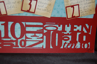
Here is the "10" border from Graphically Speaking up close.
It is kind of hard to see in this photo, but I used faux stitching around the letters and numbers so they stand out a bit.
And here is another look at the two pages together. This layout took me about 4 days to complete ~ I worked it in between work and other projects. I had to walk away several times and come back and almost gave up....glad I stuck it out!!!
Thanks Sheila for having me on your blog today!!


6 comments:
Love it Lori!!!
Did you know you won on my blog?!
Gaby:)
This is such a great layout. I just love the whole idea of reflecting on and scrapping the best of the year. Thanks for using Graphically Speaking as it is a favorite that ot set aside... I needed a reminder of how good that cart is! Thanks for joining us today at Shes A Sassy Lady!
Really great :) I can't believe I have been blogging a complete year in 2010! Wow. Tts!
Cool layout, its interesting to see one without photos, but this doesn't need them. Its great that you show the steps you've taken designing it on the Gypsy.
Hi, Lori!!! Wow, have I missed you and all your wonderful creations!!! So glad to be back!!!
What a wonderful layout you've created on your Gypsy. I really need to work more with mine -- wished you lived closer to me!!! LOL!
Hope you and family enjoyed your holidays! Now I've gotta head over and leave you some love at Sheila's!!!
Love it!
~Kim
Post a Comment